Brand identity proposal

A healthier identity,
designed for people.

Three distinct visual systems built to communicate trust, compassion, and professional care—each balancing modern clarity with a deeply human point of view.

Explore the directions
01Trust

Clear, credible, and reassuring at every touchpoint.

02Compassion

A warm identity that keeps people at the center.

03Professionalism

A complete system designed for healthcare complexity.
Direction01
Identity concept

Human Connection

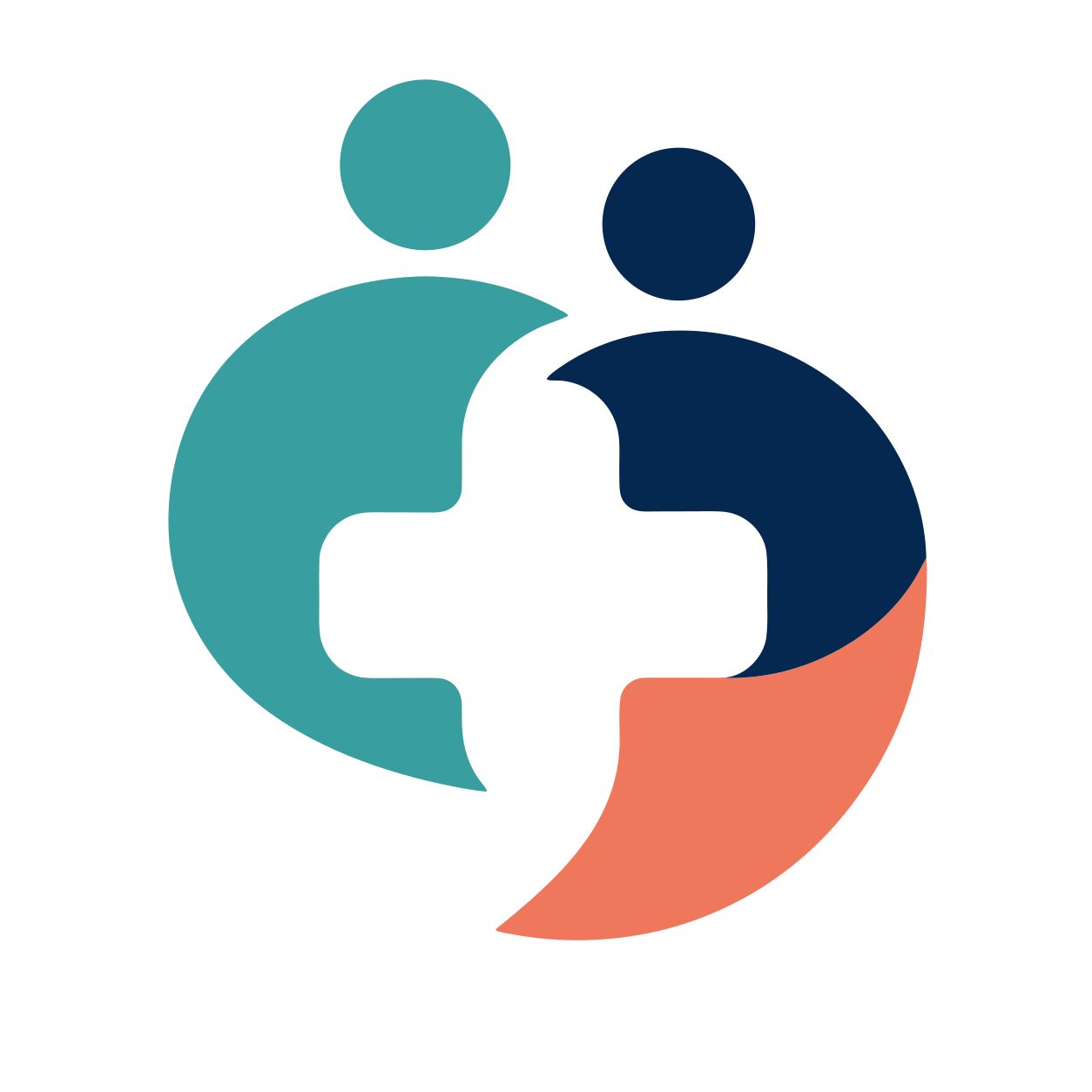
Human Connection logo mark
SymbolPrimary mark
01

Care feels more human when people feel seen.

Two individuals form a shared center of care. The open, circular silhouette feels welcoming and collaborative, while the cross-shaped negative space establishes immediate healthcare recognition.

CompassionateRecognizableInclusive
Primary lockup
HEALTHCAREORGANIZATION
Color system

Built for warmth, clarity, and accessible contrast.

Trust Navy#04284F
Care Teal#399E9F
Human Coral#EF785C
Warm Canvas#F4EFE7
Typography
Aa
Humanist SansClear at every scale

ABCDEFGHIJKLMNOPQRSTUVWXYZ
abcdefghijklmnopqrstuvwxyz

Human Connection patient-centered healthcare photography
Photography direction

Care in the moment

Warm, natural-light portraits that capture eye contact, touch, and authentic conversations.

  • Natural, directional light
  • Authentic patient–provider moments
  • Warm, realistic skin tones
Brand in practice

Designed to work everywhere care happens.

Together is where care begins.

Environmental
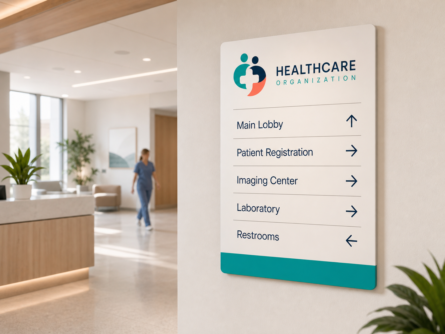
Human Connection healthcare environmental signage mockup
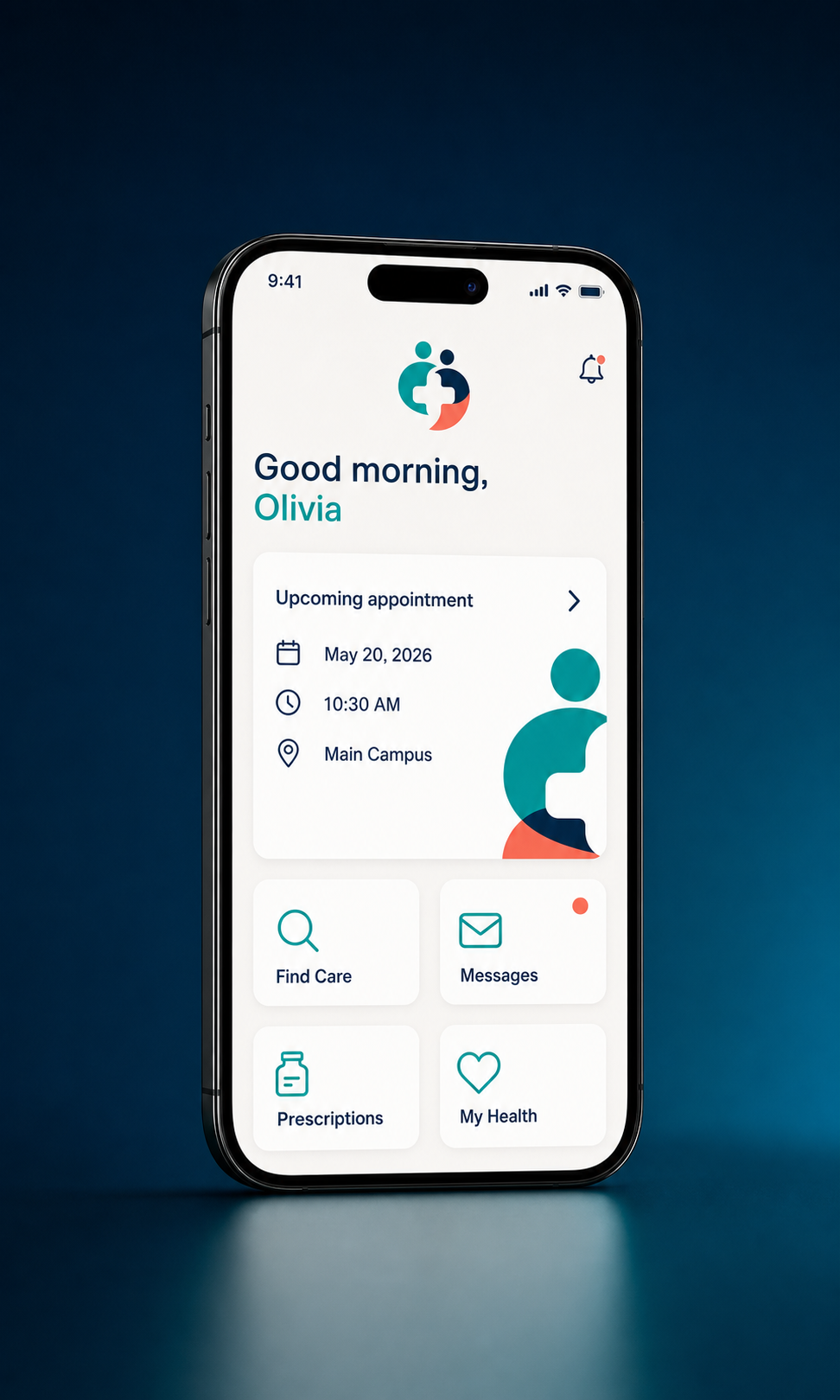
Digital care
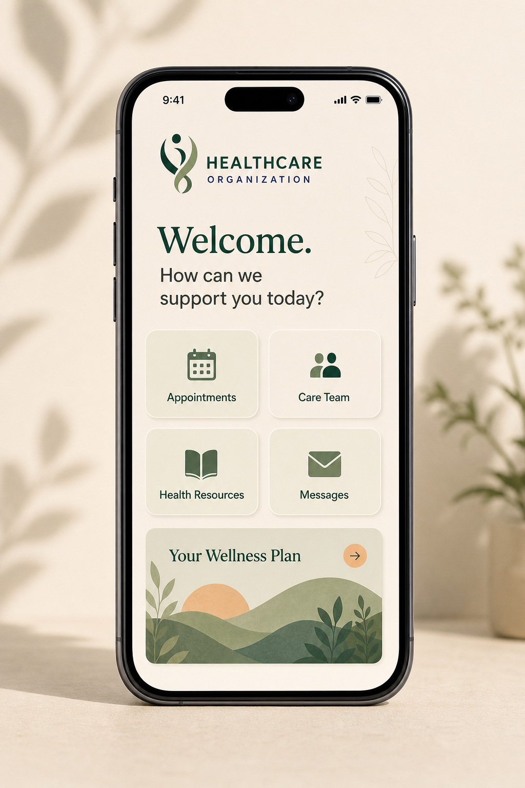
Human Connection patient care mobile application mockup
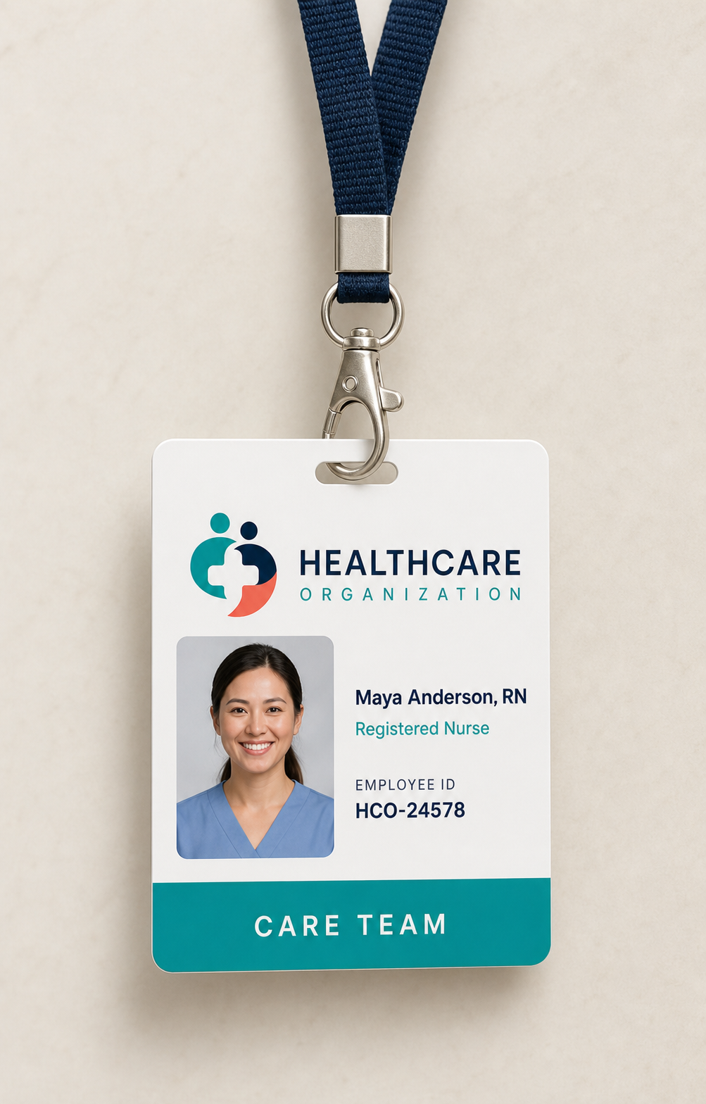
People & culture
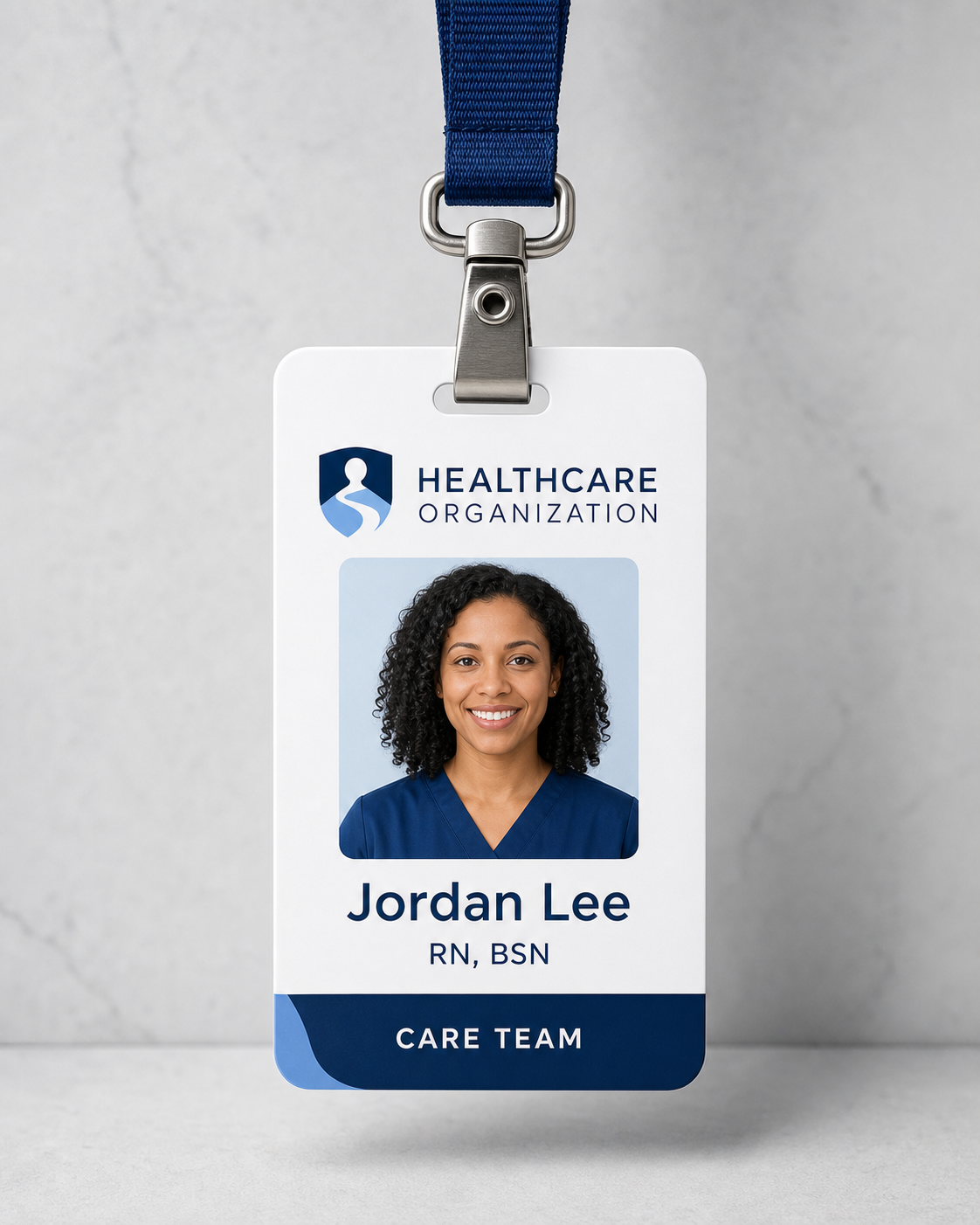
Human Connection healthcare staff badge and lanyard mockup
Direction02
Identity concept

Clear Path

Clear Path logo mark
SymbolPrimary mark
02

Confidence comes from knowing the way forward.

A protected path flows through a confident shield, balancing institutional trust with a sense of movement. The figure and horizon signal a guided journey from uncertainty to better health.

AssuredIntelligentProgressive
Primary lockup
HEALTHCAREORGANIZATION
Color system

Built for warmth, clarity, and accessible contrast.

Midnight#032151
Clear Blue#78A8E7
Pale Sky#D7E7F8
Cool Mist#F2F5F8
Typography
Aa
Humanist SansClear at every scale

ABCDEFGHIJKLMNOPQRSTUVWXYZ
abcdefghijklmnopqrstuvwxyz

Clear Path patient-centered healthcare photography
Photography direction

Clarity at every step

Bright, composed scenes that show clinicians guiding patients through decisions and recovery.

  • Natural, directional light
  • Authentic patient–provider moments
  • Warm, realistic skin tones
Brand in practice

Designed to work everywhere care happens.

A clear path to feeling better.

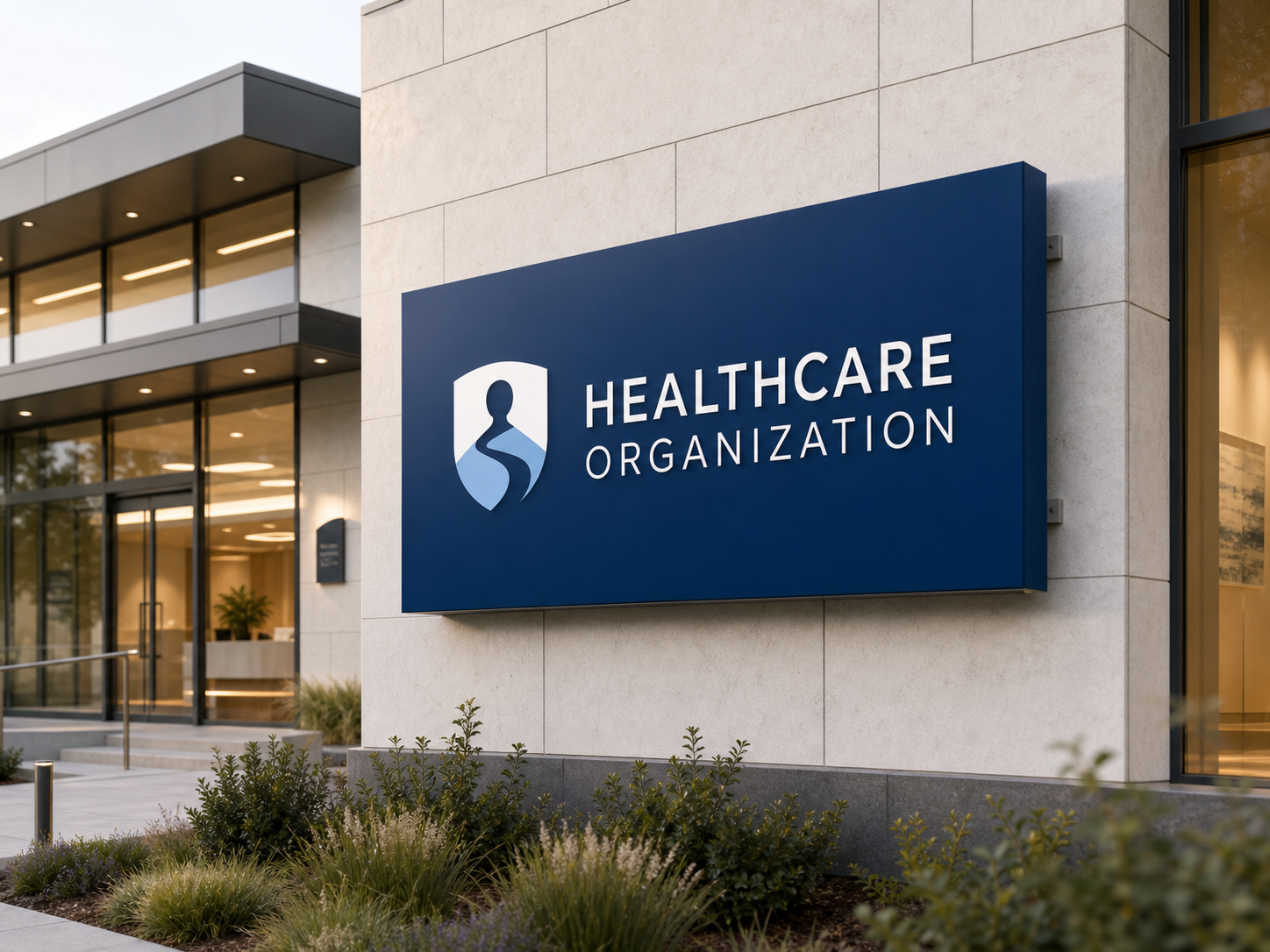
Environmental
Clear Path healthcare environmental signage mockup
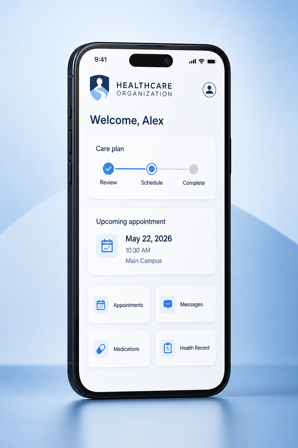
Digital care
Clear Path patient care mobile application mockup
People & culture
Clear Path healthcare staff badge and lanyard mockup
Direction03
Identity concept

Living Well

Living Well logo mark
SymbolPrimary mark
03

Health is a relationship that grows over time.

An elegant ribbon forms a person in motion—rooted, rising, and supported. Its organic curves connect whole-person care with vitality, growth, and a lasting partnership.

HolisticOptimisticEnduring
Primary lockup
HEALTHCAREORGANIZATION
Color system

Built for warmth, clarity, and accessible contrast.

Forest#284735
Sage#91966A
Soft Leaf#BCBD9F
Warm Ivory#F5F0E6
Typography
Aa
Humanist SansClear at every scale

ABCDEFGHIJKLMNOPQRSTUVWXYZ
abcdefghijklmnopqrstuvwxyz

Living Well patient-centered healthcare photography
Photography direction

Wellness in real life

Sunlit, grounded photography that places care in gardens, homes, and everyday community life.

  • Natural, directional light
  • Authentic patient–provider moments
  • Warm, realistic skin tones
Brand in practice

Designed to work everywhere care happens.

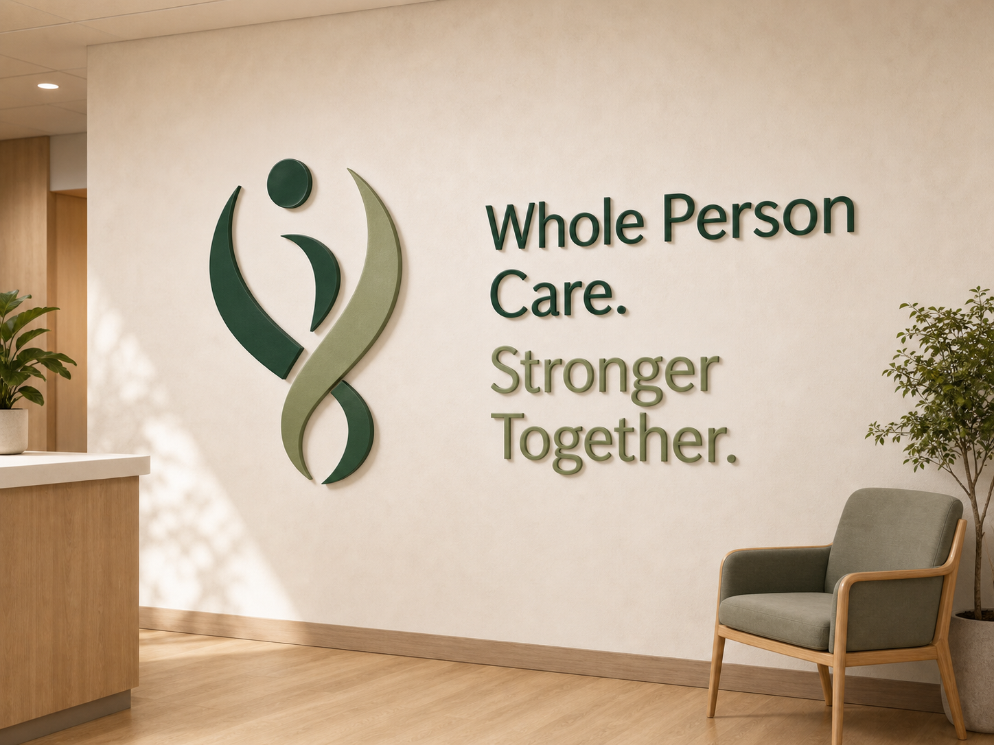
Whole-person care. Stronger together.
Environmental
Living Well healthcare environmental signage mockup
Digital care
Living Well patient care mobile application mockup
People & culture
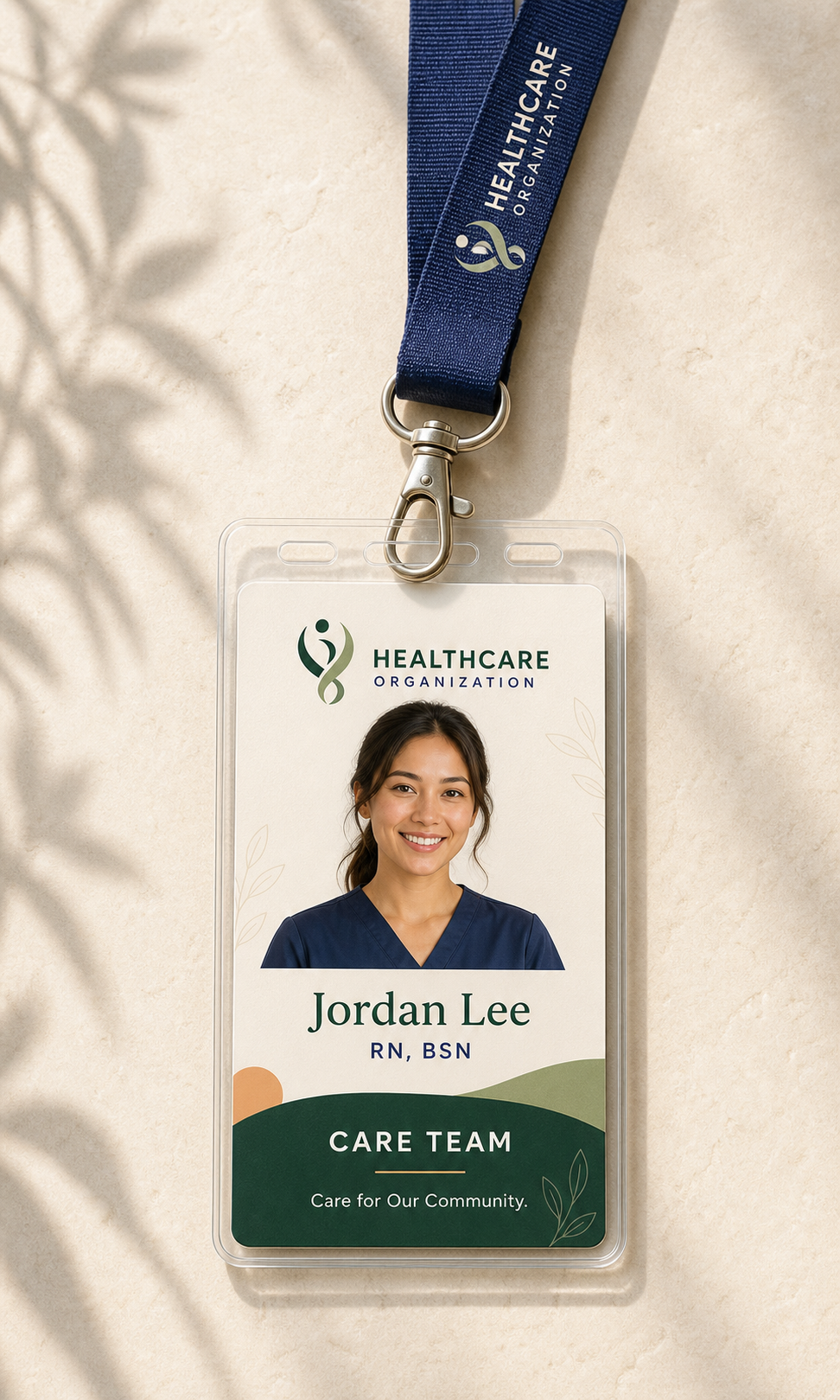
Living Well healthcare staff badge and lanyard mockup
At a glance

Three ways to express better care.

DirectionCore ideaBest suited forBrand energy
01 · Human ConnectionShared carePatient-centered systemsWarm & recognizable
02 · Clear PathGuided progressIntegrated care networksConfident & precise
03 · Living WellWhole-person growthWellness-led organizationsOrganic & optimistic