Enter
The open door makes the brand feel immediate and welcoming—an invitation into a place that feels discovered, not advertised.
Logo concept · 01
A modern identity for a cocktail-centric, tapas-focused street bar in the Philippines—built around the moment of stepping out of the everyday.
01 · The concept
01 / 04Escape should feel like a threshold: casual from the street, considered once you step inside. The mark turns that experience into one compact gesture.
Rather than placing a cocktail next to a door, the two ideas become one. That makes the identity ownable, memorable, and useful from a glowing storefront to the corner of a social post.
The open door makes the brand feel immediate and welcoming—an invitation into a place that feels discovered, not advertised.
The coupe is built into the doorway. It identifies the category without resorting to a separate, generic bar icon.
The coral dot works like a doorknob, a garnish, and a recurring visual cue across signage, print, and social.
02 · The identity
02 / 04A tall, narrow wordmark gives the identity the confidence of nightlife signage without leaning on nightclub clichés. The mark carries the story; the type gives it pace.
The open door reads first at distance; the coupe rewards a closer look. The coral dot anchors both meanings.
03 · In the world
03 / 04The identity stays restrained while the experience supplies the texture: glowing signage, tactile menus, cognac leather, warm timber, cocktails, tapas, and sound.
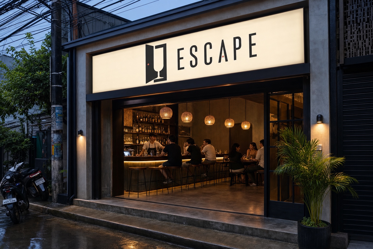
The horizontal lockup turns a compact shopfront into a clear evening landmark.
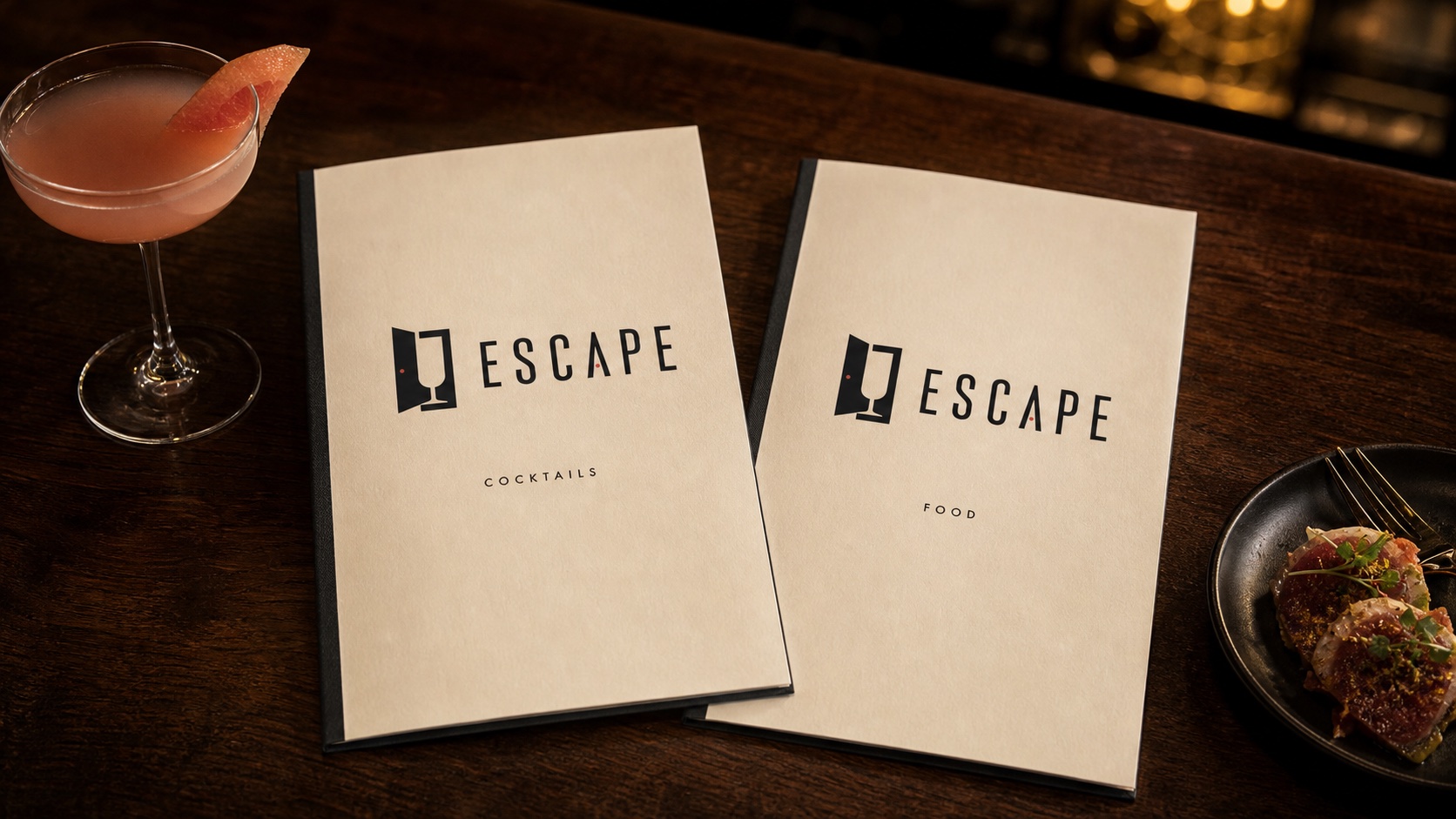
At the table
Warm ivory stock and charcoal binding make the menu feel tactile and collected. The coral dot is the only accent the application needs.
03 · The campaign language
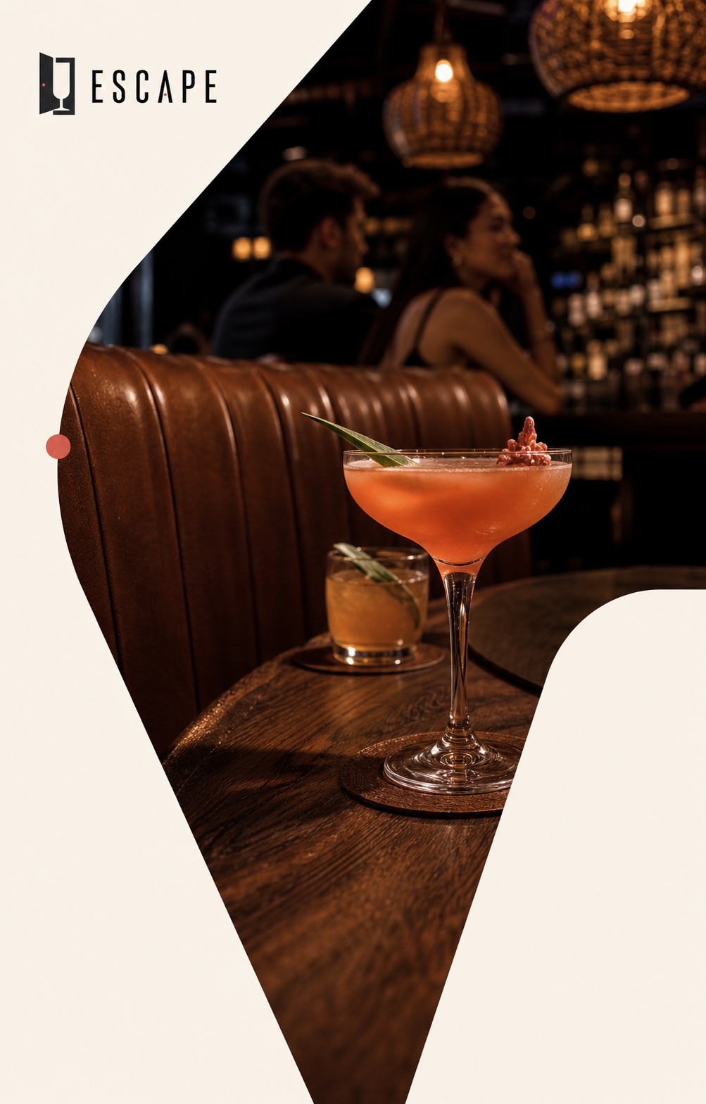
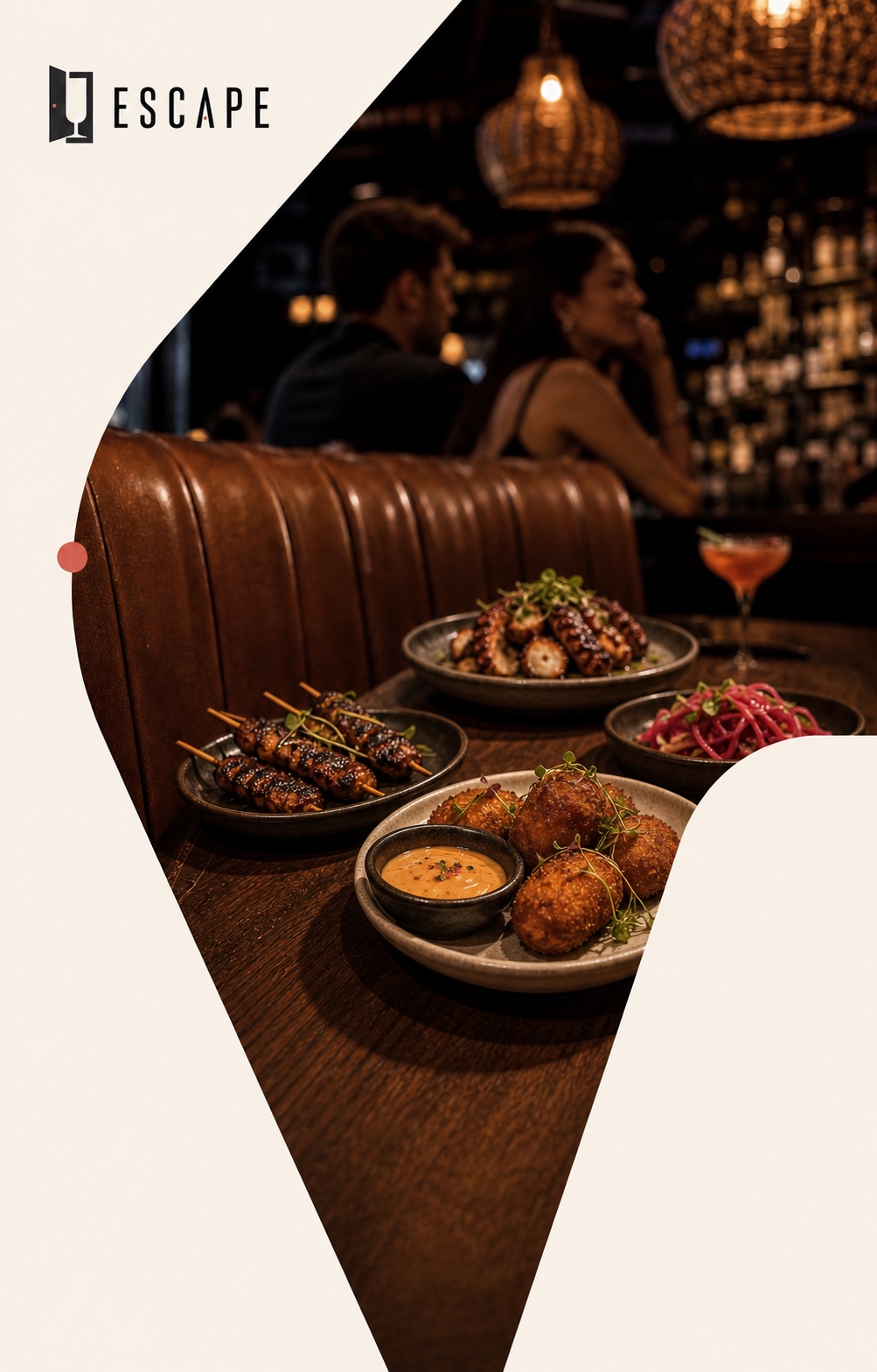
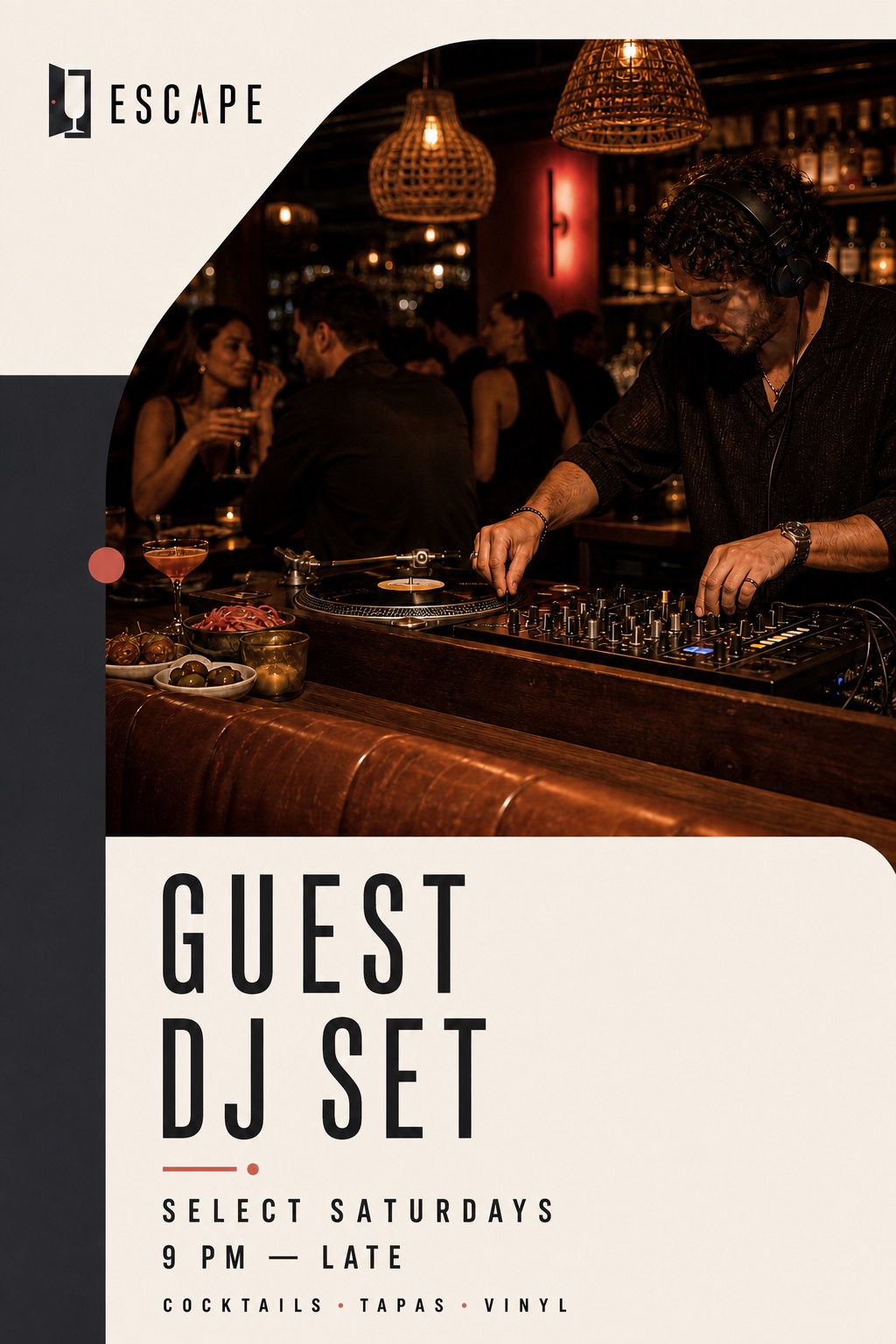
A flexible crop system creates recognition without making every post identical.
 01
A product-led frame with enough restraint to let the drink do the talking.
 02
The same visual language expands naturally from the bar to the table.
 03
A flexible event format keeps occasional DJ sets inside the core brand world.
04 · Recommendation
04 / 04Recommended direction
It gives Escape a story people can understand instantly and discover again over time. More importantly, it already behaves like a system—not just a logo on a blank page.
Step out. Settle in.
Alternative option · In motion
Bonus directionAs an alternative presentation, the identity can arrive through motion: the doorway opens, the coupe appears, and the full Escape story resolves in a single, memorable sequence.